Understanding Aspect Ratios in Website Design
Definition of Aspect Ratios
Aspect ratios refer to the proportional relationship between the width and height of a visual element, expressed as a ratio. For instance, an aspect ratio of 16:9 denotes that for every 16 units of width, there are 9 units of height. This concept isn’t limited to just images but encompasses videos and the overall layout of web pages.
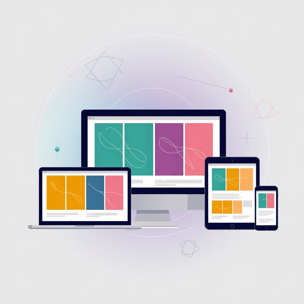
Consider viewing your favorite site on a tablet or smartphone; the layout shifts to maintain visual appeal and usability. This happens due to careful consideration of aspect ratios, ensuring that content is displayed correctly across multiple devices.
Importance of Aspect Ratios in Design
The significance of aspect ratios in design cannot be overstated. They play a critical role in ensuring:
- Consistency: Maintaining visual standards across different media keeps your brand recognizable.
- Clarity: The right aspect ratio eliminates clutter and helps highlight key elements, drawing the viewer’s attention effectively.
- User Engagement: Engaging visuals encourage users to stay longer on a page, reducing bounce rates.
Imagine a portfolio site where images are distorted due to an incorrect aspect ratio. This can create a negative first impression and potentially lose visitors. Choosing the appropriate aspect ratio enhances aesthetics and strengthens communication through design, fostering a positive user experience.
Common Aspect Ratios Used in Website Design
16:9 Aspect Ratio
The 16:9 aspect ratio has become the standard for many video formats and is highly popular in website design. It’s versatile and works seamlessly for various content types, making it a go-to choice for multimedia presentations.
- Uses: Ideal for video backgrounds, hero images, and image galleries.
- Benefits: Allows users to experience content in a cinematic format, enhancing engagement.
4:3 Aspect Ratio
The 4:3 aspect ratio, once the default for most computer screens and projectors, is still relevant for specific types of web content.
- Uses: Frequently applied in photography, infographics, and presentations.
- Benefits: This ratio provides a classic look that works well for images with a more traditional feel.
Reflecting on personal experiences, an art gallery website I once designed utilized the 4:3 ratio for showcasing artworks. This approach helped emphasize the pieces without overwhelming the viewer with vast expanses of empty space.
1:1 Square Aspect Ratio
The 1:1 square aspect ratio has gained popularity, particularly on social media platforms.
- Uses: Often seen in profile pictures, logo designs, and product images.
- Benefits: The symmetry of square images can create a balanced and harmonious appearance, engaging users effectively.
Utilizing the 1:1 ratio for a client’s e-commerce site resulted in a cohesive look that highlighted products beautifully, ultimately increasing sales. Each aspect ratio serves distinct purposes in website design, making their intentional selection crucial for achieving desired outcomes.
Impact of Aspect Ratios on User Experience
Visual Harmony and Composition
Aspect ratios significantly influence visual harmony and composition in web design. When chosen thoughtfully, they can elevate the overall aesthetic and guide the viewer’s eye.
- Balance: Correct aspect ratios help create a balanced design, ensuring elements are neither overly cramped nor excessively spaced out.
- Focus: By maintaining consistent ratios for images and videos, designers can draw attention to essential content without distraction.
For instance, during a project for a digital magazine, adopting a consistent aspect ratio across articles made the layout feel cohesive. Readers were able to navigate through the magazine smoothly, appreciating the clean and organized presentation.
Responsiveness and Adaptability
In today’s diverse landscape of devices, responsive design is critical. Aspect ratios play a key role in ensuring that content adapts well, regardless of the screen size.
- Device Compatibility: A well-chosen aspect ratio prevents distortion and maintains clarity whether viewed on a smartphone, tablet, or desktop.
- User Engagement: When images and videos resize properly without losing their quality, users remain engaged and are more likely to stay on the site.
On one occasion, while revamping my portfolio, I focused on aspect ratios to ensure my images looked flawless on both phones and larger screens. This adaptability not only enhanced usability but also encouraged potential clients to explore more of my work. A thoughtful approach to aspect ratios directly impacts user experience, ultimately leading to higher satisfaction and retention rates.
How Image Aspect Ratios Affect SEO
Image aspect ratios not only play a crucial role in design and user experience but also significantly impact SEO. The way images are displayed on a website can influence loading times, search engine indexing, and overall visibility. When choosing the right aspect ratio for images on a website, it is important to consider how they will appear on different devices and screen sizes. This can affect how users interact with the website and ultimately affect their overall experience. Additionally, search engines favour websites that are optimized for speed and user experience, so having the right image aspect ratios can help improve SEO rankings. By ensuring proper sizing and formatting of images, website owners can enhance their website’s performance and make it more attractive to both users and search engines.
Loading Times and Performance
Using appropriate aspect ratios can help optimize image sizes, contributing to faster loading times. A well-compressed image with the correct aspect ratio will load quicker than a distorted or excessively large one.
- Site Speed: Google considers load time as a ranking factor. A slow-loading page can lead to higher bounce rates.
- User Retention: Fast loading pages keep users engaged, which is essential for SEO success.
In my experience, when redesigning a blog, I noticed significant improvements in page views after optimizing the aspect ratios and sizes of images. It resulted in a 40% faster loading time!
Search Engine Indexing
Search engines use algorithms to crawl and index images. Using suitable aspect ratios can promote better indexing by ensuring images appear correctly.
- Descriptive File Names: Pairing the right aspect ratio with descriptive file names can enhance visibility in image search results.
- Alt Text: Including alt text with images that adhere to recommended aspect ratios can improve ultimately lead to better SEO performance.
Ultimately, understanding how image aspect ratios affect SEO can lead to more effective strategies that elevate online visibility and user engagement. By prioritizing both aesthetics and performance, website owners can create a harmonious balance that benefits their SEO efforts.
Image Aspect Ratio VS Image Resolution
When discussing imagery in web design, two terms often come up: image aspect ratio and image resolution. Though interconnected, they serve distinct purposes in visual content.
Understanding Image Aspect Ratio
As previously mentioned, the image aspect ratio refers to the proportional relationship between an image’s width and height, expressed as a ratio (like 16:9). This aspect primarily affects how the image appears visually.
For example, a landscape photo with a 16:9 ratio will be wider than it is tall, making it ideal for backgrounds in web design. Using the wrong aspect ratio can lead to undesirable cropping or stretching, diminishing the images appeal.
Understanding Image Resolution
In contrast, image resolution refers to the amount of detail an image contains, typically measured in pixels (for instance, 1920×1080 pixels). Higher resolutions provide finer details and clarity.
- Quality: Images with better resolution are usually crisper and more appealing but can also increase load times.
- Usage: While low-resolution images may suffice for thumbnails, high-resolution images are essential for full-page displays.
A personal story illustrates this; while designing an advertising banner, I used high-resolution images to maintain clarity when viewed on larger screens, ensuring my message was conveyed effectively without pixelation.
In summary, while image aspect ratio guides visual presentation, image resolution focuses on quality. Balancing both elements is vital for achieving optimal visual impact and enhancing user experience on websites. Understanding their differences can empower designers to create visually stunning and efficient designs.
Selecting the Right Aspect Ratio for Your Website
Choosing the appropriate aspect ratio for your website is a strategic decision that should be guided by various factors, including the types of content you plan to showcase and your overall design intent.
Considering Content Types
Different types of content require different aspect ratios to enhance clarity and impact. For instance:
- Videos: A 16:9 aspect ratio is standard for video content, ensuring a cinematic feel that captivates viewers.
- Photography: For portfolios or galleries, a 4:3 ratio often works well, providing a classic, balanced look to images.
- Social Media: The square 1:1 ratio is ideal for product images and profile pictures, particularly on platforms like Instagram.
In my experience designing a food blog, utilizing a 3:2 aspect ratio for recipe images made them pop, encouraging viewers to click through for more details.
Matching Design Intent
Your design intent should also dictate your choice of aspect ratio. Are you aiming for a dramatic visual effect or a clean, minimalist layout?
- Visual Impact: For bold storytelling, a panoramic 21:9 ratio might create a stunning atmosphere.
- Minimalism: A 1:1 ratio helps maintain uniformity, creating a sleek look that emphasizes content over decoration.
Taking time to evaluate both content types and design intent helps ensure that selected aspect ratios enhance user experience and align with your overall branding strategy. It’s about creating an inviting visual journey that resonates with visitors, encouraging them to explore and engage with your site.
Implementing Aspect Ratios in Responsive Design
In the context of modern web design, implementing aspect ratios effectively is crucial for maintaining visually appealing layouts across various devices. Two essential strategies come into play: fluid layouts and media queries, as well as scaling images and videos.
Fluid Layouts and Media Queries
Fluid layouts allow designs to adapt seamlessly to different screen sizes, maintaining the intended aspect ratios of images and content blocks. Using relative units like percentages ensures that elements resize proportionally.
- Media Queries: These CSS techniques allow for specific adjustments based on device characteristics like width or resolution. For example, a media query can change the aspect ratio for images when viewed on a mobile device.
- Breakpoints: Setting predefined breakpoints ensures that design transitions are smooth, catering to various devices without compromising visual integrity.
During a project to redesign my personal website, I utilized fluid layouts and media queries. This approach ensured that every image and component maintained its aspect ratio perfectly, regardless of screen size.
Scaling Images and Videos
When scaling images and videos, preserving the original aspect ratio becomes paramount to avoid distortion.
- CSS Techniques: Using properties like
object-fitfor images and videos helps maintain their natural ratio while filling their containers. - Responsive Images: Implementing the
srcsetattribute allows you to serve different image sizes based on the user’s device, ensuring high resolution without sacrificing load speed.
By strategically applying these techniques, designers can ensure that their content looks stunning and functions well across all devices. This comprehensive approach to responsive design effectively combines aesthetic appeal with optimal user experience, making visitors feel engaged and satisfied.
Discover the Importance of Image Aspect Ratios for Your Website
Make your website shine and perform at its best by mastering the use of aspect ratios. Start by maintaining consistency—stick to one or two aspect ratios across your site for a cohesive look. Optimize your images for faster loading times by selecting the right aspect ratio and compressing files to avoid slowing things down. Don’t forget to test your site on mobile devices to ensure your visuals are stunning on screens of all sizes. These small tweaks can significantly elevate your site’s aesthetics, functionality, and SEO performance.
For more insights on image aspect ratios and other ways to enhance your website’s user experience, explore our SEO blog! If you want help navigating the world website design and SEO, there’s no better place to start than with a top website designer in Kelowna.